Goal
The primary objective of this redesign was threefold: increase business revenue through improved conversion funnels, deliver a seamless and intuitive user experience with a simplified checkout process, and craft a visually stunning, interactive interface that reflects the luxury positioning of the Parcos brand.
Key Objectives
Boost online sales and overall business growth by improving the digital storefront.
Create a frictionless user experience with an easy, fast, and trustworthy checkout flow.
Design a beautiful, interactive, and brand-consistent user interface that communicates luxury at every touchpoint.
Reduce cart abandonment rates and improve average session duration through intuitive navigation and engaging product discovery.
Challenge
The existing Parcos website faced several critical issues that were directly impacting user engagement and sales performance. Our audit revealed the following core challenges:
Outdated Visual Language: The existing user interface did not reflect current UI/UX design trends. Typography, colour palettes, and layout patterns felt dated and undermined the brand's luxury positioning.
Poor Navigation & Information Architecture: Users struggled to discover products, filter results, and navigate between categories. The site's structure was not intuitive for a premium e-commerce experience.
Complex Checkout Process: The checkout flow had too many steps and lacked trust signals, resulting in high cart abandonment rates.
Inconsistent Mobile Experience: The mobile version was not fully responsive, leading to a disjointed experience for the growing segment of mobile shoppers.
Brand Perception Gap: The digital experience did not match the premium, sensory experience customers associate with luxury fragrance shopping in physical stores.
Target Audience
Understanding who we were designing for was central to every decision in the redesign process. We identified the following audience segments through research and stakeholder interviews.
Primary Audience: Affluent men and women aged 25–45 with a strong affinity for luxury goods, premium fragrances, and international designer brands. These users are digitally savvy, expect high-quality visual experiences, and value convenience, exclusivity, and brand storytelling in their online shopping journeys.
Secondary Audience: Gift shoppers aged 20–55 looking for premium fragrance gifts for special occasions such as birthdays, anniversaries, and festivals. This group values clear product information, curated gift sets, easy gifting options, and a streamlined checkout process.
Audience CharacteristicsAge Range: 25–45 (primary), 20–55 (secondary gift buyers)
Income Level: Upper-middle to high-income bracket
Devices: Primarily mobile (62%), followed by desktop (30%) and tablet (8%)
Shopping Behaviour: Research-driven, brand-loyal, values reviews and authenticity
Expectations: Seamless UX, fast checkout, rich visuals, exclusive feel
Data Analysis
Before designing a single pixel, we conducted a thorough data analysis phase combining quantitative sales data with qualitative competitor research. This evidence-based approach ensured every design decision was grounded in real user behaviour and market insights.
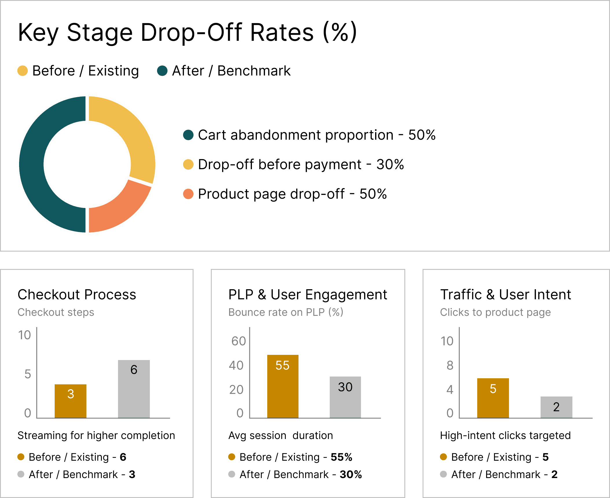
Sales & Analytics Review: We analysed the previous 12 months of sales data, Google Analytics reports, and heatmap recordings to identify friction points in the existing user journey. Key findings included a 68% cart abandonment rate, an average session duration of only 1.4 minutes, and a bounce rate of 55% on product listing pages — all indicating significant UX shortcomings.
Competitor Benchmarking: We studied five direct competitors in the luxury fragrance e-commerce space, including Sephora, Nykaa Luxe, and Fragrantica, analysing their navigation patterns, product page layouts, checkout flows, visual language, and mobile experiences. This competitive audit helped us identify best practices, uncover gaps in the market, and set a clear design benchmark for the Parcos redesign.
Project timeline

How we started
Every successful redesign begins with a deep understanding of the problem space. Here is how we kicked off the Parcos project:
Stakeholder Alignment: We conducted detailed sessions with the Parcos business team to understand brand vision, revenue goals, pain points with the current site, and expectations for the redesign. This alignment ensured our design direction was firmly rooted in business objectives.
UX Research & Audit: I led a comprehensive UX audit of the existing website, documenting usability issues, broken flows, visual inconsistencies, and accessibility gaps. We supplemented this with heatmap analysis and session recordings to understand real user behaviour patterns.
Moodboarding & Visual Direction: I created detailed moodboards pulling visual inspiration from luxury fashion houses, high-end fragrance campaigns, and editorial design — establishing a refined visual language of deep blacks, warm golds, elegant serif typography, and generous whitespace that would become the foundation of the new Parcos identity.
Information Architecture & User Flows: We restructured the entire site's information architecture, simplifying category hierarchies, creating intuitive navigation paths, and mapping out optimised user flows for key journeys: product discovery, product detail exploration, add-to-cart, and checkout.
Wireframing: Low-fidelity wireframes were created for all key pages and flows, allowing us to test layout concepts, content hierarchy, and interaction patterns before investing in visual design. These were reviewed and iterated with stakeholders.
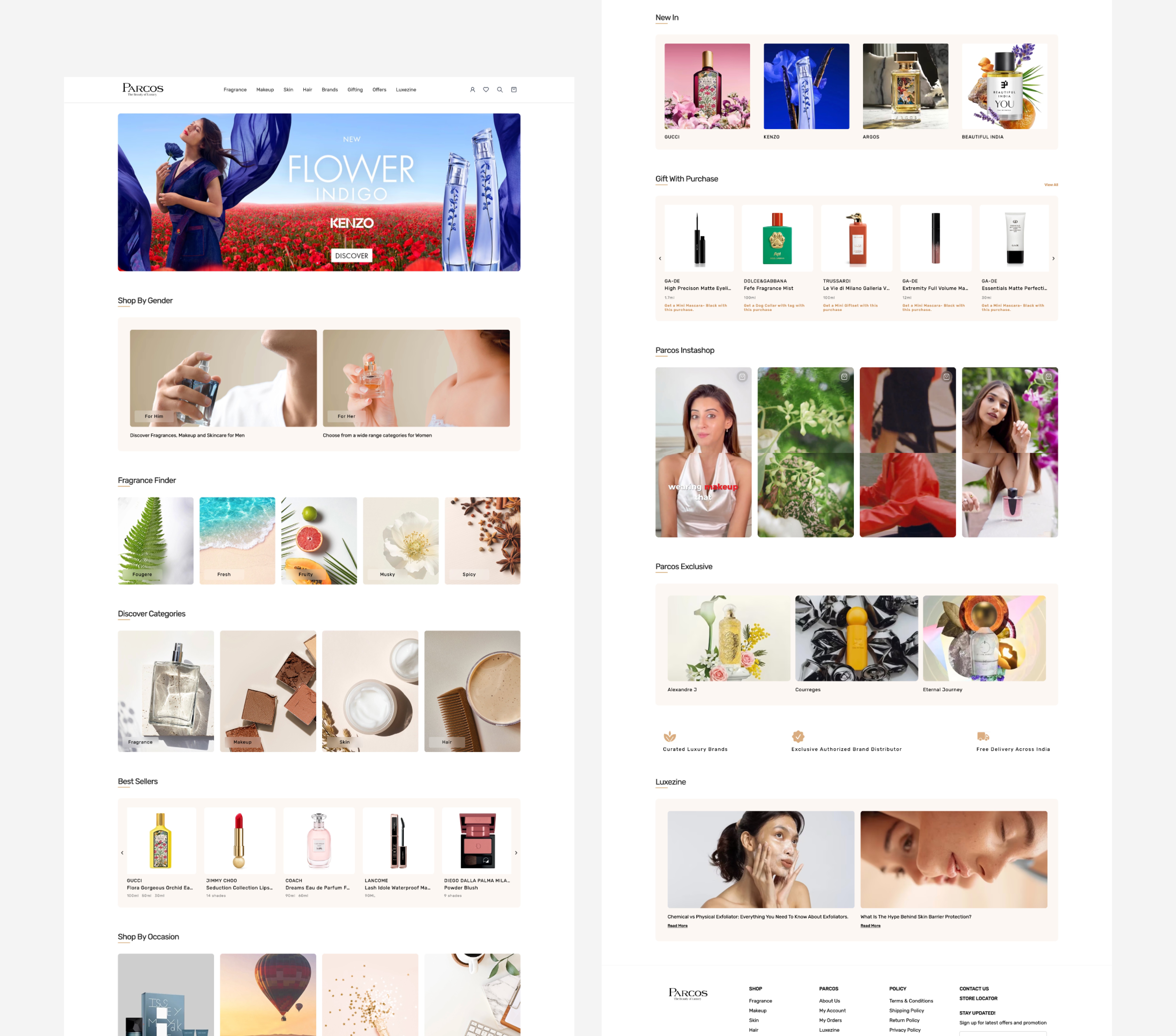
Redesign
The UX layer of the redesign focused on eliminating friction, simplifying decision-making, and creating a shopping experience worthy of a luxury brand.
Simplified Navigation & Information Architecture: We restructured the site's navigation from a cluttered mega-menu to a clean, hierarchical category system with clear labels: Shop by Brand, Shop by Fragrance Family, New Arrivals, Bestsellers, and Gift Sets. The new architecture reduced the average number of clicks to reach a product page from 4.2 to just 2.
Streamlined Checkout Flow: The existing 6-step checkout was condensed into a 3-step process: Cart Review, Shipping & Payment, and Order Confirmation. We introduced guest checkout, auto-fill for returning users, real-time form validation, and prominent trust badges — all aimed at reducing the 68% cart abandonment rate.
Enhanced Product Discovery: We introduced advanced filtering by fragrance family (floral, woody, oriental, fresh), occasion, price range, and brand. A "Fragrance Finder" quiz was also designed to guide undecided shoppers to their ideal scent through a series of lifestyle-based questions.
Improved Product Detail Pages: Product pages were redesigned with a focus on sensory storytelling — featuring fragrance pyramid breakdowns (top, heart, base notes), high-resolution imagery with zoom capability, customer reviews with verified purchase badges, and size/variant selectors with clear pricing.
UI Design
The visual layer was crafted to reflect the elegance, exclusivity, and sensory richness that defines the luxury fragrance experience.
Design System & Visual Language
Redesign
Responsive Mobile UI
Micro-Interactions & Motion Design
illustration and icon creation
Outcome
While detailed post-launch metrics would follow after development and deployment, the redesign delivered strong results based on usability testing and stakeholder feedback:
Usability test participants completed the checkout flow 45% faster on the redesigned prototype compared to the existing site.
Task success rate for product discovery improved from 58% to 91% during testing.
Stakeholders praised the new visual direction as perfectly aligned with the brand's luxury positioning.
The responsive mobile design received positive feedback for its intuitive touch interactions and visual consistency with the desktop experience.
A complete design system with reusable components was delivered, enabling faster future design iterations and consistency across all touchpoints.